Responsimple

Responsimple

Un sistema de retícula CSS simple, flexible & responsive

Read in English Ver Video Tutoriales

¿Qué es?

Responsimple es un sistema de retícula mobile first escrito 100% en código CSS puro con increíbles características

Características

Descarga e Instalación:

Uso Básico:

Un simple reseteo

Este es el corazón del reseteo de Responsimple


html {
  -ms-box-sizing: border-box;
  -moz-box-sizing: border-box;
  -webkit-box-sizing: border-box;
  box-sizing: border-box;
  font-family: sans-serif;
  font-size: 16px;
  -ms-text-size-ajust: 100%;
  -moz-text-size-ajust: 100%;
  -webkit-text-size-ajust: 100%;
  text-size-ajust: 100%;
  background-color: #FFF;
  color: #000;
}


body { overflow-x: hidden; }


*, *::after, *::before {
  -ms-box-sizing: inherit;
  -moz-box-sizing: inherit;
  -webkit-box-sizing: inherit;
  box-sizing: inherit;
  margin: 0;
  padding: 0;
}


Los tamaños de fuente iniciales para los encabezados en Responsimple


h1 { 
  font-size: 32px;
  font-size: 2rem;
}

h2 { 
  font-size: 28px;
  font-size: 1.75rem;
}

h3 { 
  font-size: 24px;
  font-size: 1.5rem;
}

h4 { 
  font-size: 20px;
  font-size: 1.25rem;
}

h5 { 
  font-size: 16px;
  font-size: 1rem;
}

h6 { 
  font-size: 12px;
  font-size: .75rem;
}
			

Todos las etiquetas HTML inline, los párrafos y los elementos de listas heredan el tamaño de fuente del contenedor


a, abbr, b, code, dfn, em, i, li, mark, p, pre, strong { font-size: inherit; }
			

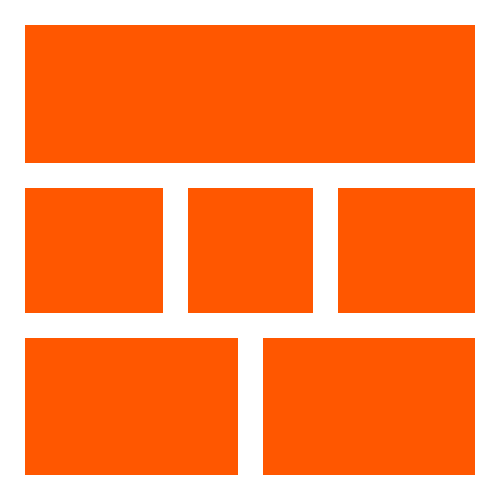
Contenedores & Items

Responsimple usa contenedores e items para estructurar la retícula. Éste es el código inicial de estos elementos


.container, .container-full {
  display: block;
  width: 100%;
  margin: auto;
  font-size: 0;
}				

.container { max-width: 1200px; }
			

.item {
  display: block;
  width: 100%;
  padding: 16px;
  padding: 1rem;
  font-size: 16px;
  font-size: 1rem;
}					
			

2 Tipos de Contenedores

Puedes usar contenedores con el ancho de la página (.container-full) or contenedores con 1200px's de ancho máximo (.container)

Ejemplo de Full Container

<section class="container-full">
  <article class="item">1</article>
  <article class="item">2</article>
  <article class="item">3</article>
  <article class="item">4</article>
</section>
				
Item 1
Item 2
Item 3
Item 4
Ejemplo de Container

<section class="container">
  <article class="item">Item 1</article>
  <article class="item">Item 2</article>
  <article class="item">Item 3</article>
  <article class="item">Item 4</article>
</section>
			
Item 1
Item 2
Item 3
Item 4

Un Sistema de Retícula Mobile First con 12 Columnas y 4 Tamaños de Media Queries:

  1. Teléfonos < (30em or 480px)
    usa .ph1 to .ph12
  2. Dispositivos Pequeños < (48em or 768px)
    usa .sm1 to .sm12
  3. Dispositivos Medianos < (64em or 1024px)
    usa .md1 to .md12
  4. Dispositivos Grandes > (64em or 1024px)
    usa .lg1 to .lg12

<section class="container  center">
  <article class="item  ph12  sm12  md12  lg12">Col 12</article>
  <article class="item  ph11  sm11  md11  lg11">Col 11</article>
  <article class="item  ph10  sm10  md10  lg10">Col 10</article>
  <article class="item  ph9  sm9  md9  lg9">Col 9</article>
  <article class="item  ph8  sm8  md8  lg8">Col 8</article>
  <article class="item  ph7  sm7  md7  lg7">Col 7</article>
  <article class="item  ph6  sm6  md6  lg6">Col 6</article>
  <article class="item  ph5  sm5  md5  lg5">Col 5</article>
  <article class="item  ph4  sm4  md4  lg4">Col 4</article>
  <article class="item  ph3  sm3  md3  lg3">Col 3</article>
  <article class="item  ph2  sm2  md2  lg2">Col 2</article>
  <article class="item  ph1  sm1  md1  lg1">Col 1</article>
</section>	
			
Col 12
Col 11
Col 10
Col 9
Col 8
Col 7
Col 6
Col 5
Col 4
Col 3
Col 2
Col 1

Múltiples Técnicas de Maquetación

  1. Floats
  2. Display inline-block
  3. Flexbox
Maquetación con Floats:
Clases CSS para maquetación con Floats
Teléfonos Dispositivos Pequeños Dispositivos Medianos Dispositivos Grandes
.floatl .sm-floatl .md-floatl .lg-floatl
.floatr .sm-floatr .md-floatr .lg-floatr
.nofloat .sm-nofloat .md-nofloat .lg-nofloat
.clear .sm-clear .md-clear .lg-clear

<section class="container  clear">
  <article class="item  floatl  ph12  sm6  md4  lg3">1</article>
  <article class="item  floatl  ph12  sm6  md4  lg3">2</article>
  <article class="item  floatl  ph12  sm6  md4  lg3">3</article>
  <article class="item  floatl  ph12  sm6  md4  lg3">4</article>
  <article class="item  floatl  ph12  sm6  md4  lg3">5</article>
  <article class="item  floatl  ph12  sm6  md4  lg3">6</article>
  <article class="item  floatl  ph12  sm6  md4  lg3">7</article>
  <article class="item  floatl  ph12  sm6  md4  lg3">8</article>
  <article class="item  floatl  ph12  sm6  md4  lg3">9</article>
  <article class="item  floatl  ph12  sm6  md4  lg3">10</article>
  <article class="item  floatl  ph12  sm6  md4  lg3">11</article>
  <article class="item  floatl  ph12  sm6  md4  lg3">12</article>
</section>
			
1
2
3
4
5
6
7
8
9
10
11
12
Maquetación con Display inline-block:
Clases CSS para maquetación con Display inline-block
Teléfonos Dispositivos Pequeños Dispositivos Medianos Dispositivos Grandes
.i-b .sm-i-b .md-i-b .lg-i-b

<section class="container">
  <article class="item  i-b  v-top  ph12  sm6  md4  lg3">1</article>
  <article class="item  i-b  v-top  ph12  sm6  md4  lg3">2</article>
  <article class="item  i-b  v-top  ph12  sm6  md4  lg3">3</article>
  <article class="item  i-b  v-top  ph12  sm6  md4  lg3">4</article>
  <article class="item  i-b  v-top  ph12  sm6  md4  lg3">5</article>
  <article class="item  i-b  v-top  ph12  sm6  md4  lg3">6</article>
  <article class="item  i-b  v-top  ph12  sm6  md4  lg3">7</article>
  <article class="item  i-b  v-top  ph12  sm6  md4  lg3">8</article>
  <article class="item  i-b  v-top  ph12  sm6  md4  lg3">9</article>
  <article class="item  i-b  v-top  ph12  sm6  md4  lg3">10</article>
  <article class="item  i-b  v-top  ph12  sm6  md4  lg3">11</article>
  <article class="item  i-b  v-top  ph12  sm6  md4  lg3">12</article>
</section>
			
1
2
3
4
5
6
7
8
9
10
11
12
Maquetación con Flexbox:
Clases CSS para maquetación con Flexbox
Teléfonos Dispositivos Pequeños Dispositivos Medianos Dispositivos Grandes
Propiedades Flexbox para Padres
display: flex | inline-flex ; usa:
.flex .sm-flex .md-flex .lg-flex
.flex-inline .sm-flex-inline .md-flex-inline .lg-flex-inline
flex-direction: row | column | row-reverse | column-reverse ; usa:
.flex-row .sm-flex-row .md-flex-row .lg-flex-row
.flex-column .sm-flex-column .md-flex-column .lg-flex-column
.flex-row-reverse .sm-flex-row-reverse .md-flex-row-reverse .lg-flex-row-reverse
.flex-column-reverse .sm-flex-column-reverse .md-flex-column-reverse .lg-flex-column-reverse
flex-wrap: nowrap | wrap | wrap-reverse ; usa:
.flex-nowrap .sm-flex-nowrap .md-flex-nowrap .lg-flex-nowrap
.flex-wrap .sm-flex-wrap .md-flex-wrap .lg-flex-wrap
.flex-wrap-reverse .sm-flex-wrap-reverse .md-flex-wrap-reverse .lg-flex-wrap-reverse
justify-content: flex-start | flex-end | center | space-between | space-around ; usa:
.jc-flex-start .sm-jc-flex-start .md-jc-flex-start .lg-jc-flex-start
.jc-flex-end .sm-jc-flex-end .md-jc-flex-end .lg-jc-flex-end
.jc-center .sm-jc-center .md-jc-center .lg-jc-center
.jc-space-between .sm-jc-space-between .md-jc-space-between .lg-jc-space-between
.jc-space-around .sm-jc-space-around .md-jc-space-around .lg-jc-space-around
align-items: flex-start | flex-end | center | baseline | stretch ; usa:
.ai-flex-start .sm-ai-flex-start .md-ai-flex-start .lg-ai-flex-start
.ai-flex-end .sm-ai-flex-end .md-ai-flex-end .lg-ai-flex-end
.ai-center .sm-ai-center .md-ai-center .lg-ai-center
.ai-baseline .sm-ai-baseline .md-ai-baseline .lg-ai-baseline
.ai-stretch .sm-ai-stretch .md-ai-stretch .lg-ai-stretch
align-content: flex-start | flex-end | center | stretch | space-between | space-around ; usa:
.ac-flex-start .sm-ac-flex-start .md-ac-flex-start .lg-ac-flex-start
.ac-flex-end .sm-ac-flex-end .md-ac-flex-end .lg-ac-flex-end
.ac-center .sm-ac-center .md-ac-center .lg-ac-center
.ac-space-between .sm-ac-space-between .md-ac-space-between .lg-ac-space-between
.ac-space-around .sm-ac-space-around .md-ac-space-around .lg-ac-space-around
.ac-stretch .sm-ac-stretch .md-ac-stretch .lg-ac-stretch
Propiedades Flexbox para Hijos
flex: none | auto ; usa:
.flex-none .sm-flex-none .md-flex-none .lg-flex-none
.flex-auto .sm-flex-auto .md-flex-auto .lg-flex-auto
align-self: flex-start | flex-end | center | stretch | baseline | auto ; usa:
.as-flex-start .sm-as-flex-start .md-as-flex-start .lg-as-flex-start
.as-flex-end .sm-as-flex-end .md-as-flex-end .lg-as-flex-end
.as-center .sm-as-center .md-as-center .lg-as-center
.as-baseline .sm-as-baseline .md-as-baseline .lg-as-baseline
.as-stretch .sm-as-stretch .md-as-stretch .lg-as-stretch
.as-auto .sm-as-auto .md-as-auto .lg-as-auto

<section class="container  flex  flex-wrap">
  <article class="item  flex-auto  ph12  sm6  md4  lg3">1</article>
  <article class="item  flex-auto  ph12  sm6  md4  lg3">2</article>
  <article class="item  flex-auto  ph12  sm6  md4  lg3">3</article>
  <article class="item  flex-auto  ph12  sm6  md4  lg3">4</article>
  <article class="item  flex-auto  ph12  sm6  md4  lg3">5</article>
  <article class="item  flex-auto  ph12  sm6  md4  lg3">6</article>
  <article class="item  flex-auto  ph12  sm6  md4  lg3">7</article>
  <article class="item  flex-auto  ph12  sm6  md4  lg3">8</article>
  <article class="item  flex-auto  ph12  sm6  md4  lg3">9</article>
  <article class="item  flex-auto  ph12  sm6  md4  lg3">10</article>
  <article class="item  flex-auto  ph12  sm6  md4  lg3">11</article>
  <article class="item  flex-auto  ph12  sm6  md4  lg3">12</article>
</section>
			
1
2
3
4
5
6
7
8
9
10
11
12

Características Adicionales:

Responsimple, no pretende ser un Framework Front end, sin embargo, proveé clases adicionales para modificar el Modelo de Caja de CSS

Todas las clases están disponibles en los 4 tamaños de media queries con su correspondiente prefijo

Clases CSS Adicionales de Responsimple
Regla CSS Teléfonos Dispositivos Pequeños Dispositivos Medianos Dispositivos Grandes
Alineaciones Verticales & Horizontales
vertical-align: top; .v-top .sm-v-top .md-v-top .lg-v-top
vertical-align: middle; .v-middle .sm-v-middle .md-v-middle .lg-v-middle
vertical-align: bottom; .v-bottom .sm-v-bottom .md-v-bottom .lg-v-bottom
vertical-align: baseline; .v-baseline .sm-v-baseline .md-v-baseline .lg-v-baseline
text-align: left; .left .sm-left .md-left .lg-left
text-align: center; .center .sm-center .md-center .lg-center
text-align: right; .right .sm-right .md-right .lg-right
text-align: justify; .justify .sm-justify .md-justify .lg-justify
Tamaños de Fuente
font-size: 0; .f0 .sm-f0 .md-f0 .lg-f0
font-size: .25rem; .f_25 .sm-f_25 .md-f_25 .lg-f_25
font-size: .5rem; .f_5 .sm-f_5 .md-f_5 .lg-f_5
font-size: .75rem; .f_75 .sm-f_75 .md-f_75 .lg-f_75
font-size: 1rem; .f1 .sm-f1 .md-f1 .lg-f1
font-size: 1.25rem; .f1_25 .sm-f1_25 .md-f1_25 .lg-f1_25
font-size: 1.5rem; .f1_5 .sm-f1_5 .md-f1_5 .lg-f1_5
font-size: 1.75rem; .f1_75 .sm-f1_75 .md-f1_75 .lg-f1_75
font-size: 2rem; .f2 .sm-f2 .md-f2 .lg-f2
font-size: 2.5rem; .f2_5 .sm-f2_5 .md-f2_5 .lg-f2_5
font-size: 3rem; .f3 .sm-f3 .md-f3 .lg-f3
font-size: 3.5rem; .f3_5 .sm-f3_5 .md-f3_5 .lg-f3_5
font-size: 4rem; .f4 .sm-f4 .md-f4 .lg-f4
font-size: 4.5rem; .f4_5 .sm-f4_5 .md-f4_5 .lg-f4_5
font-size: 5rem; .f5 .sm-f5 .md-f5 .lg-f5
Márgenes y Rellenos
margin: auto; .mauto .sm-mauto .md-mauto .lg-mauto
margin: 0; .m0 .sm-m0 .md-m0 .lg-m0
margin: .25rem; .m_25 .sm-m_25 .md-m_25 .lg-m_25
margin: .5rem; .m_5 .sm-m_5 .md-m_5 .lg-m_5
margin: .75rem; .m_75 .sm-m_75 .md-m_75 .lg-m_75
margin: 1rem; .m1 .sm-m1 .md-m1 .lg-m1
margin: 1.25rem; .m1_25 .sm-m1_25 .md-m1_25 .lg-m1_25
margin: 1.5rem; .m1_5 .sm-m1_5 .md-m1_5 .lg-m1_5
margin: 1.75rem; .m1_75 .sm-m1_75 .md-m1_75 .lg-m1_75
margin: 2rem; .m2 .sm-m2 .md-m2 .lg-m2
padding: auto; .pauto .sm-pauto .md-pauto .lg-pauto
padding: 0; .p0 .sm-p0 .md-p0 .lg-p0
padding: .25rem; .p_25 .sm-p_25 .md-p_25 .lg-p_25
padding: .5rem; .p_5 .sm-p_5 .md-p_5 .lg-p_5
padding: .75rem; .p_75 .sm-p_75 .md-p_75 .lg-p_75
padding: 1rem; .p1 .sm-p1 .md-p1 .lg-p1
padding: 1.25rem; .p1_25 .sm-p1_25 .md-p1_25 .lg-p1_25
padding: 1.5rem; .p1_5 .sm-p1_5 .md-p1_5 .lg-p1_5
padding: 1.75rem; .p1_75 .sm-p1_75 .md-p1_75 .lg-p1_75
padding: 2rem; .p2 .sm-p2 .md-p2 .lg-p2
Bordes y Visualizaciones
border: thin solid #000; .border .sm-border .md-border .lg-border
border: 0; .noborder .sm-noborder .md-noborder .lg-noborder
border-radius: 100%; .round .sm-round .md-round .lg-round
border-radius: 0; .noround .sm-noround .md-noround .lg-noround
display: inline; .inline .sm-inline .md-inline .lg-inline
display: block; .block .sm-block .md-block .lg-block
display: none; .none .sm-none .md-none .lg-none
elemento de lista con viñeta .bullet .sm-bullet .md-bullet .lg-bullet
elemento de lista sin viñeta .nobullet .sm-nobullet .md-nobullet .lg-nobullet

Responsimple es un projecto de @jonmircha